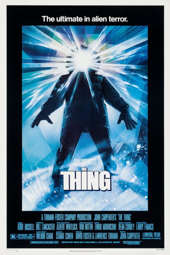
From Anatomy of a Murder (by Saul Bass) to The Thing (by Drew Struzan) a good movie poster can very much be about the work of art as much as its about the film. So why are so many recently released modern posters so uninspiring? Is the industry in crisis? Are we witnessing the end of original movie poster design? Will the movie poster survive in the digital age?
Scarface, Pulp Fiction, Breakfast at Tiffany’s, Trainspotting and Chinatown: all instant classics with a unique and punchy movie poster design, which neither misrepresented nor undersold the film. Once so respected and venerated an artform, the movie poster has become a functional product; carelessly Photoshopped, cropped and stuffed with explosions until logic, sense and any artistic ambition have been ruthlessly abandoned. In 20 years’ time, we’re unlikely to see a poster for Dirty Grandpa up on anyone’s wall.
Obviously, the main purpose of a movie poster is not to be art but to maximise box-office revenues, you would think the most effective way to do that is to create something memorable and striking.”
Unfortunately, bad posters are not part of a new trend, but there’s a boring uniformity and a lackadaisical nothingness to the majority that have been spewed out in the past few years, with independent designs becoming a rarity.
“Obviously, the main purpose of a movie poster is not to be art but to maximise box-office revenues,” says Michael Barnett, print editor of Marketing Week. “You would think the most effective way to do that is to create something memorable and striking, but most of the time, marketers will choose the low-risk option, which is to pick the one that market research tells you will appeal to the people most likely to watch your film. That’s why characters on Disney posters always have an annoying smirk and one raised eyebrow. It conveys an attitude of quirky confidence, which market research shows kids respond to.”
The task of boiling an entire film down to a single image is difficult and in itself, made more so by the various interests of everyone involved.”
The modern film poster, then, is the victim of a desperate tug-of-war, and the result of a murky cocktail of contractual obligations (lead actor’s name must be at certain font size), commercial needs (does this poster appeal to ABC1 males?), limited options (stars reassembling for a poster shoot isn’t always viable) and protracted conference calls between the designers and the studios.
“The task of boiling an entire film down to a single image is difficult in and of itself, made more so by the various interests of everyone involved,” says Alex Griendling, a designer who has worked for studios on posters for Angels and Demons and Watchmen.
“Directors want something that represents their work as they see it, marketing teams want something that will attract an audience, the producer is often stuck between the two, and the designer is trying to reconcile these opinions through their own voice. Like anything designed by a committee, these competing perspectives often steer the final product to a ‘safe’ solution.”
Sometimes, an actor’s presence on a poster can trigger a series of other requirements… if actor A is on the poster, actor B must also appear, but no larger than 75% of A.”
Alex Griendling has sat on such committees before, but when it comes to placing blame for the blandness, he points his finger at the whole industry. “I think it’s all of the aforementioned conflicts between the involved parties, and the legal requirements placed upon most posters,” he says. “Elements like the billing block [the chunk of credit text at the bottom] and actor credits [the callouts at the top of many posters] must be sized in relation to the film’s title. Sometimes, an actor’s presence on a poster can trigger a series of other requirements. For example, if actor A is on the poster, actor B must also appear, but no larger than 75% of A. As you can imagine, these requirements can quickly pile up and limit where the final poster can go, creatively.”
Illustrator Sam Gilbey, who has produced pop culture artwork for titles including Marvel’s Avengers, Teenage Mutant Ninja Turtles, The Karate Kid and Flash Gordon, argues that the introduction of Photoshop may have harmed the industry by making it easier for inexperienced designers to put together collage-style posters without the design skills to back them up.
“Obviously you think of the masters like Richard Amsel, working pre-Photoshop, and you can see how marketing departments have often thought they can now produce something similar internally,” he explains.
Simply moving photos around though, you’re not going to get that cohesiveness that an illustration can bring you.”
“If you’re simply moving photos around though, you’re not going to get that cohesiveness that an illustration can bring you. A skilled artist can take all those disparate elements and weave them together into a beautiful composition, whilst capturing the aspirational ‘feel’ of a movie at the same time. Of course now the fantastic thing is that as an artist you can use Photoshop to aid the process. The ‘problem’ is that you don’t need to be an artist to give it a try, or to understand how good compositions and colour palettes really work.”
Are Movie Posters A Casualty of Marketing
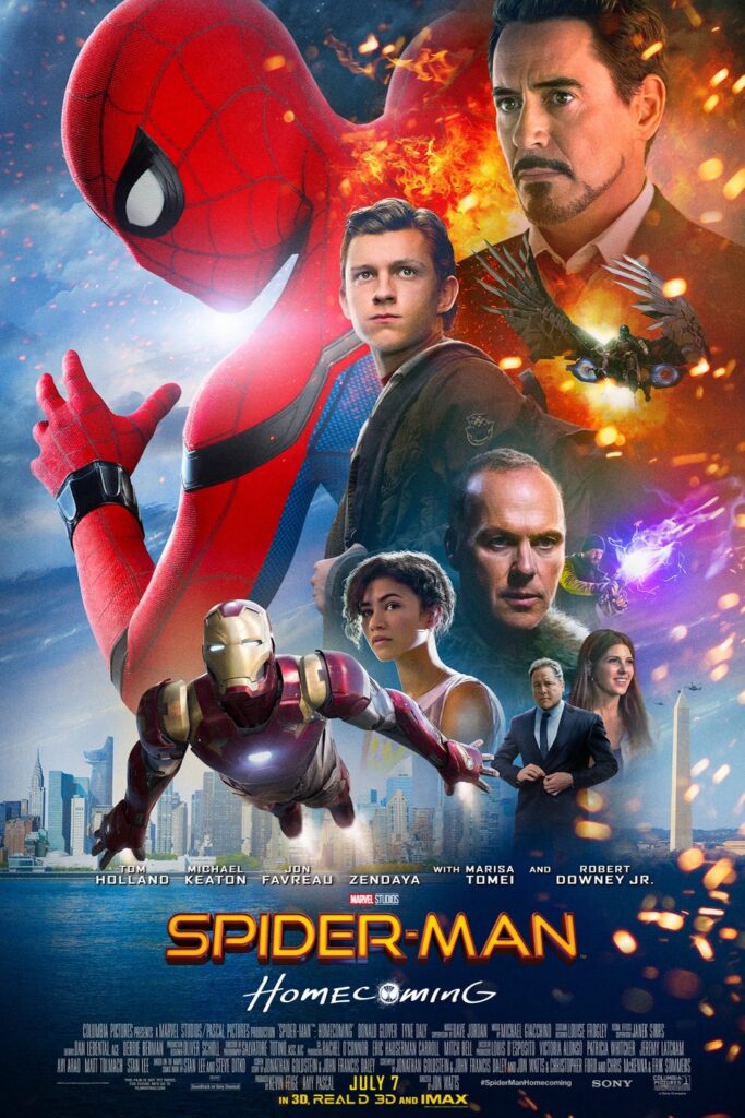
Illustrator Graham Humphreys explains. “My first impression is an issue with colour balance and the obvious cut-outs – the images don’t appear to exist in the same context,” he says.
In this poster, it would appear that no such consideration has been applied. It looks more like a page in a scrapbook.”
“Even though we are used to seeing unrealistic scale and smaller elements alongside larger ones, effects of colour and light should allow the suspension of physics and scale. In this poster, it would appear that no such consideration has been applied. It looks more like a page in a scrapbook – a concept in itself perhaps, but not one clearly intended (or relevant) here.”
Sadly, BLT – the agency that produced the Spider-Man: Homecoming poster – was unable to discuss any specifics of the poster due to the client relationship. However, this particular design is jarringly different to the posters the agency initially released, which saw Spider-Man hanging out in various NYC spots.
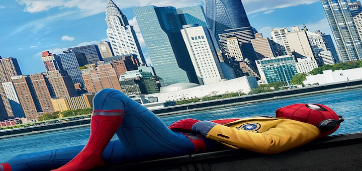
BLT is also responsible for some of the best poster designs and campaigns in recent months – its fantastic Baby Driver campaign and the brilliant rom-com Deadpool for example. So why such a break from their previous work?
Mainstream posters, by and large, are marketing tools intended to appeal to a wide base that it is assumed has no interest in lasting design or creative integrity.”
“One thing that I can recognise is client intervention,” explains Graham Humphreys. “Endless changes that will please executives, accountants and marketing needs, but changes made in ignorance of the visual cohesion that might have made a good poster. Most designers and illustrators will attest to this endless mortal combat.”
“Mainstream posters, by and large, are marketing tools intended to appeal to a wide base that it is assumed has no interest in lasting design or creative integrity. A quick look at the work of Saul Bass will tell us that this wasn’t always so. His amazing work on mainstream releases shows us that a cloud of disengaged headshots isn’t the only way a poster can communicate the core of a film.
“With access to so much imagery and visual stimuli now (more than ever), how have we become so visually illiterate that only a roughly assembled photograph of the cast reassures us we are going to be entertained? Perhaps the cult of celebrity and the selfie have crushed the soul out of mainstream cinema posters. I hope not.”
While most posters are stuck in a rut, there is a glimmer of hope – and an important change underway. Firstly, the staid nature of the medium has led to an increase in independent designers creating alternative artwork, distributing it online and often selling physical copies. It’s a rapidly expanding market and some studios have even been smart enough to collaborate with designers whose work makes a concerted effort to buck the trend. Artists such as Olly Moss and Brandon Schaefer have been recruited to bring much-needed style to a generic landscape.
It feels like overall, decent movie posters are actually becoming more common, even if they’re being done in parallel to the main campaigns.”
Sam Gibley agrees that it’s not all bad though. With an increase in alternative movie poster design by design studios such as Mondo, movie studios have clocked on to the fact that this type of aesthetic can give their movie an edge. Moonlight, The Lobster and Green Room are all examples of studios producing interesting, timeless pieces, giving hope that there are still decent mainstream movie posters out there.
“It feels like overall, decent movie posters are actually becoming more common, even if they’re being done in parallel to the main campaigns,” Gibley says.
Alternative approaches stand out even more in the current market. He points out that, although it’s a shame not many actual campaign posters are being assigned to individual artists and designers, it’s exciting to see alternative interpretations being shared on social media or given away at IMAX screenings. On top of that, many older movies are getting new artwork when they are re-released on Blu-ray. “Whilst that Spider-man one stands out for being particularly terrible, hopefully the negative reaction will actually keep moving us onwards,” he adds.
Will The Movie Poster Survive The Digital Age
As modern printing and distribution costs continue to rise, many movie studios are choosing alternative mediums to promote their films. With a shift in how posters are displayed by studios and will be consumed by the public.
More digital poster sites are being installed, that means moving images, interactivity and designs that are more targeted to the people nearby.”
“Outdoor advertising isn’t becoming less important, but what is changing is that more digital poster sites are being installed,” says Michael Barnett. “That means moving images, interactivity and designs that are more targeted to the people nearby. So a lot more ‘posters’ will probably be short movie trailers or animations rather than static images, and they’re likely to be tailored to the types of people who are most likely to walk by them.”
This means we’re entering Minority Report territory, where digital posters will start analysing passers-by in order to customise their message and use mobile-phone data to bombard you with promotional material. A brave new world – one ripe for a new level of visual inventiveness.
Will this mean the demise and eventually end of the paper movie poster? Will this mean that those uniquely designed iconic masterpieces will no longer be available in a paper format? Ultimately, who knows but with a world more focused on technology and rumours that some studios are already limiting the print runs of movie posters, it could. However, the artistic creativity used to develop these posters will continue whatever the medium used to deliver the material, as it remains an important aspect for movies that strive for originality and artistic quality.
If you liked the website, found it useful and would like to help with its continued ad-free development, you can make a donation via PayPal. Small or large, it doesn’t matter, every little helps! We thank you for your continued support.


